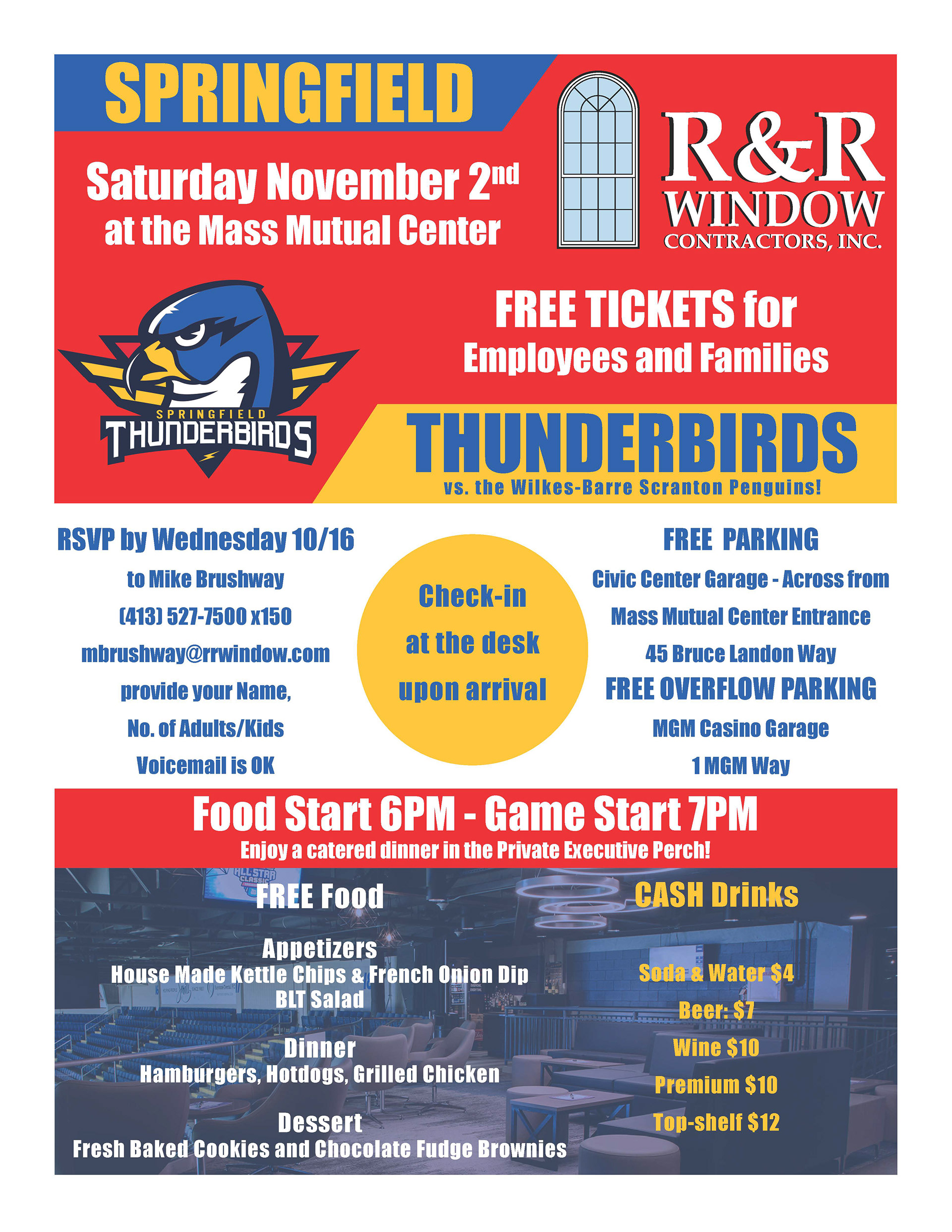
I had fun solving the problem of creating a visual hierarchy that emphasized the most important pieces out of the sheer volume I had to fit on the page. I borrowed the Springfield Thunderbirds logo from the web and carried its color scheme throughout the poster.
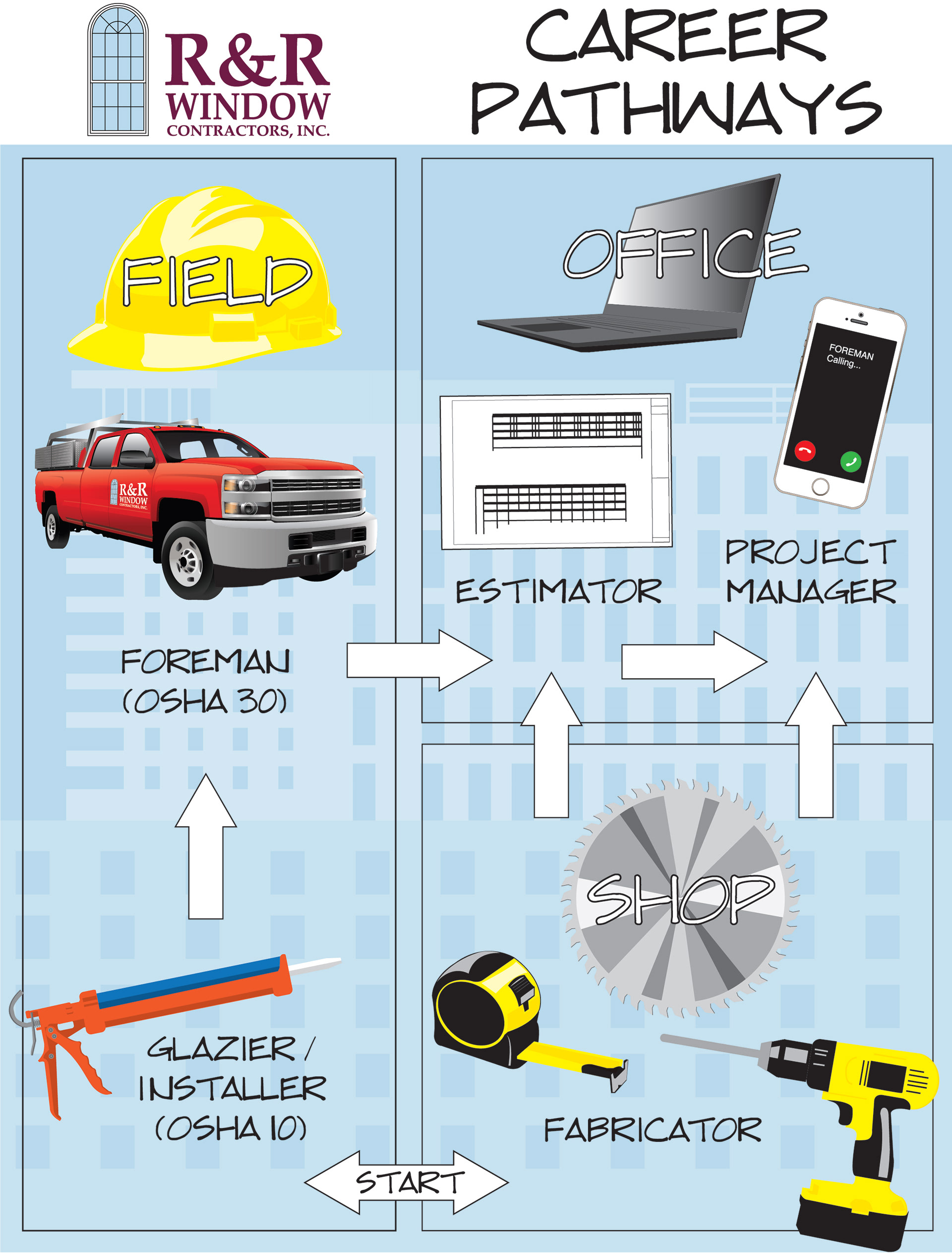
R&R Window had some recruiting visits planned to local trade high schools. I designed this info graphic in an illustrated style to keep it fun. The purpose of the hand out is to show the career pathways you can take at R&R Window.

I wanted to give this one a Five Guys feel because it was about burgers and dogs.

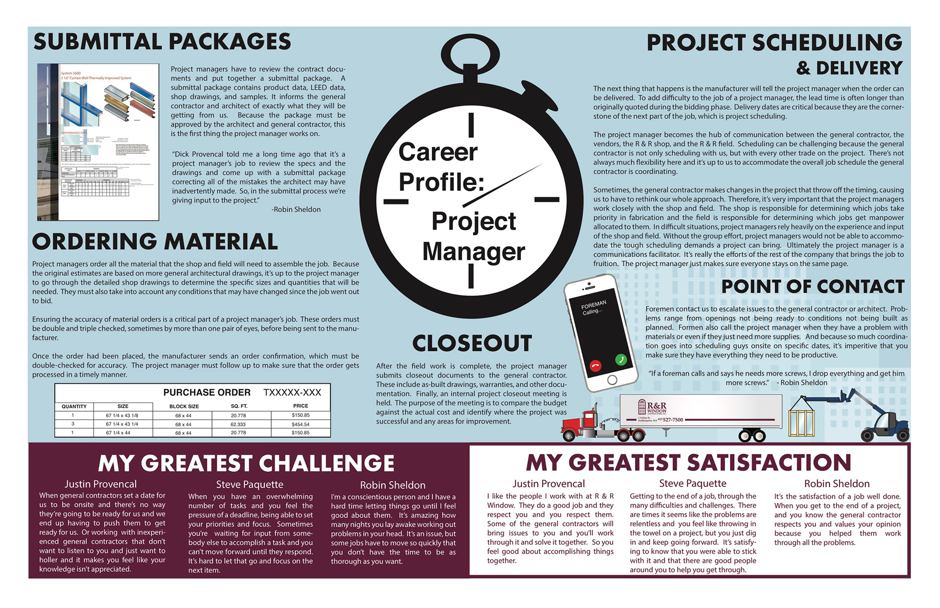
This was interior of one of our company newsletters. I created all the graphics and did the layouts. I interviewed three of our project managers and then wrote copy based on my talks with them.
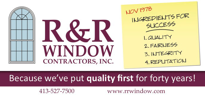
I've been trying to include our company's core values in more of our ads that we place in trade publications. I was pretty proud of this one which I wanted to make special for our 40th Anniversary in 2018.

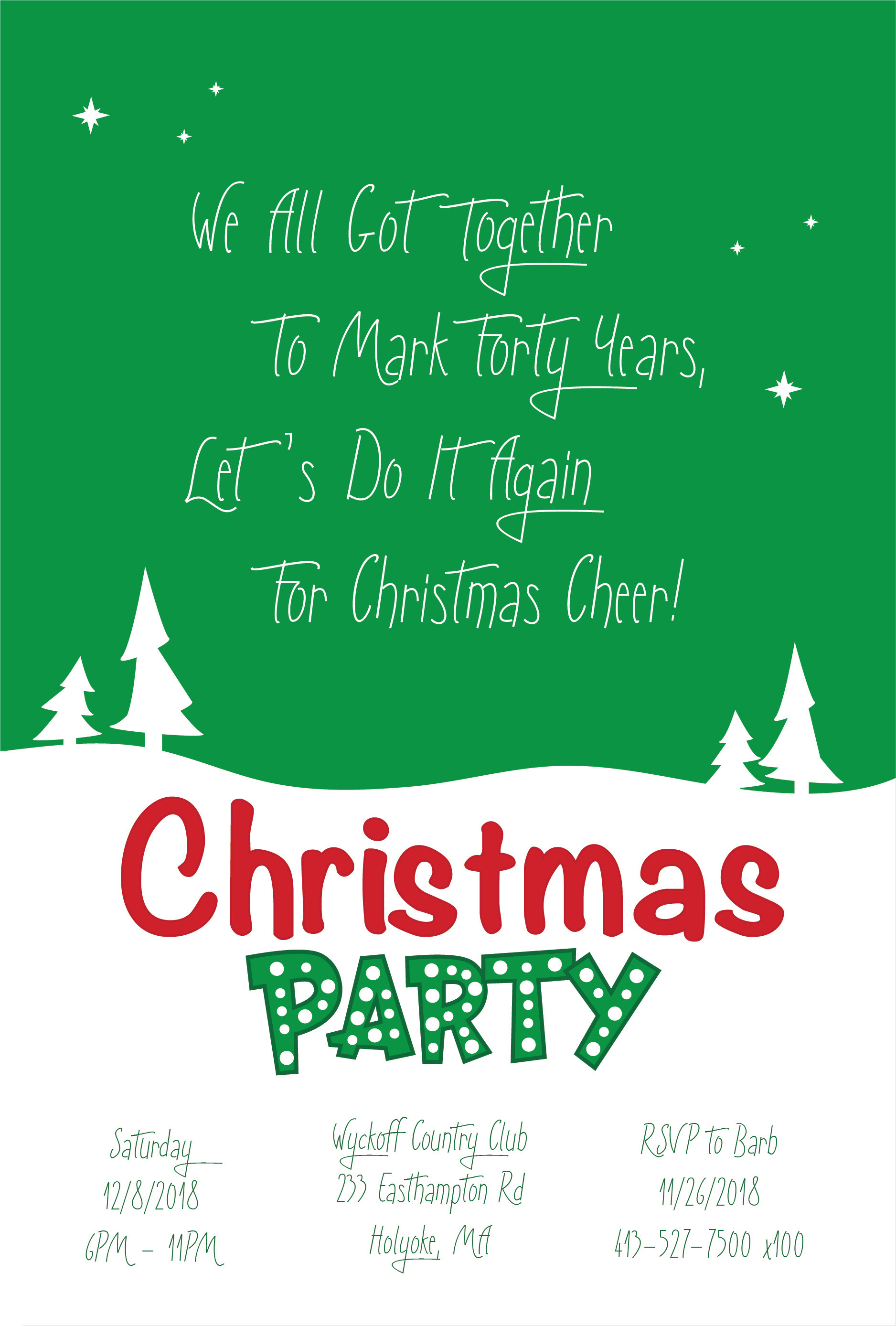
Our 40th Anniversary party was only a week before these Christmas Party invite post cards had to go out. I decided to write a rhyme about it on the card.