
This was my first entry and right out of the gate I wanted to make a shirt that pops and features a character other than the same handful that you see on most Pokemon shirts. I picked Ghastly because he's the least loved of the three ghosts in his evolutionary chain but also because I thought he'd be the most fun to paint in Photoshop. I think he'd be pretty cool and pretty scary to see in real life so I used a reference image of him from the UTGP site (below) and painted my own version of him in Photoshop, giving him plenty of shadows and highlights to show dimension. I took some liberty with his gas aura and made it more like a glowing ectoplasm as if he's materializing from another dimension.

Reference image of Ghastly provided on the UTGP site: https://www.uniqlo.com/utgp/2019/us/character#001-100
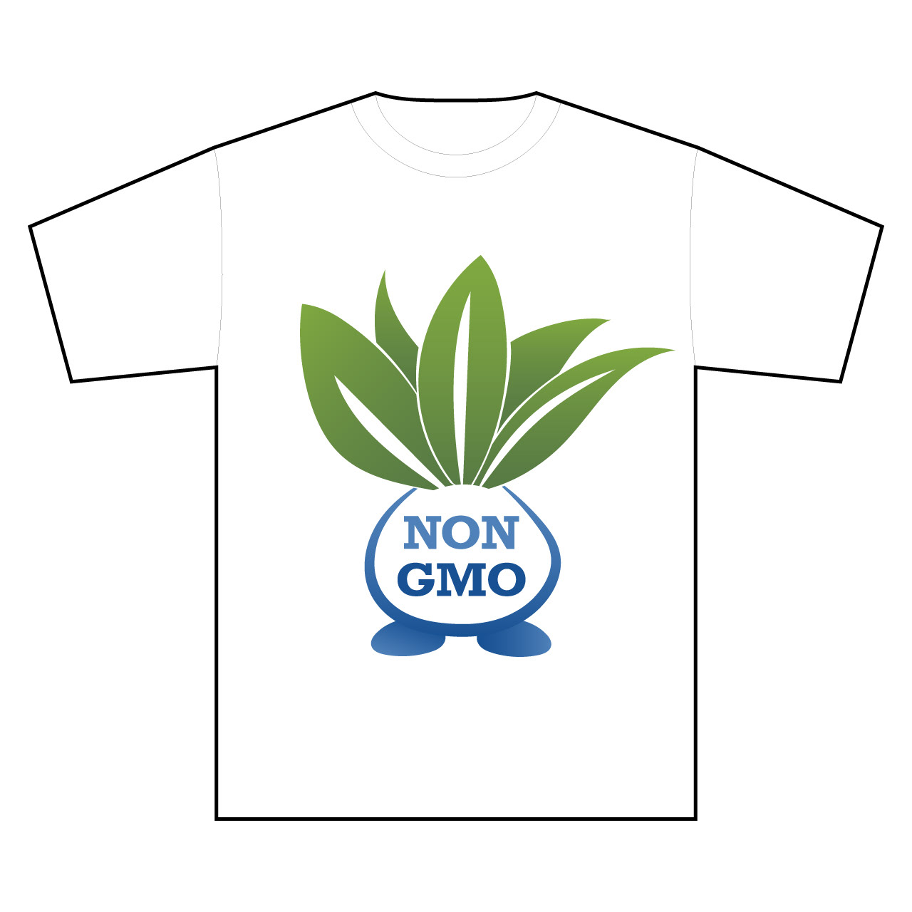
Oddish is an adorable Pokemon but you'd never expect to see Oddish on a shirt instead of Pichachu, Evee, or Jigglypuff. I have a love for designing logos in Illustrator and Oddish is a plant Pokemon with a shape that made it easy to do a play on the NON GMO logos I've seen around. And I think it pops!

Reference image of Oddish provided on the UTGP Site: https://www.uniqlo.com/utgp/2019/us/character#001-100

This was just an easy opportunity to reuse the Oddish vector I already created. It's the same idea with playing on the NON GMO and ORGANIC food scene. I'm not sure which of the two I like best... which is your favorite?
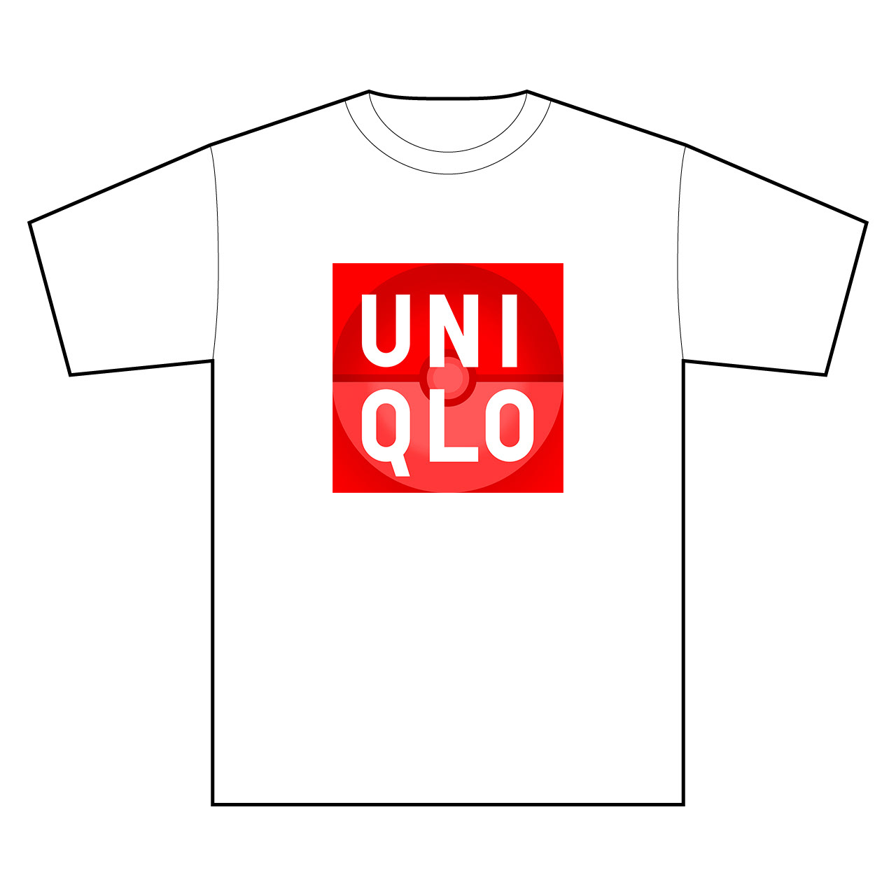
I love logos. I think the UNIQLO logo is already cool and really pops with its simple red square and bold white type. I thought, how can I put a Pokemon spin on that logo and also keep it looking like UNIQLO's logo? Although Pokemon has a logo (the yellow and blue logo-type), I sort of feel like the Pokeball is more iconic and recognized. The Pokeball is red, white, and black, and a perfect circle always fits inside a perfect square. The rest was easy, I just separated the the text from the red square and painted a low-opacity Pokeball in between so that the red was still dominant. I only needed white and black to do it... I think it pops!
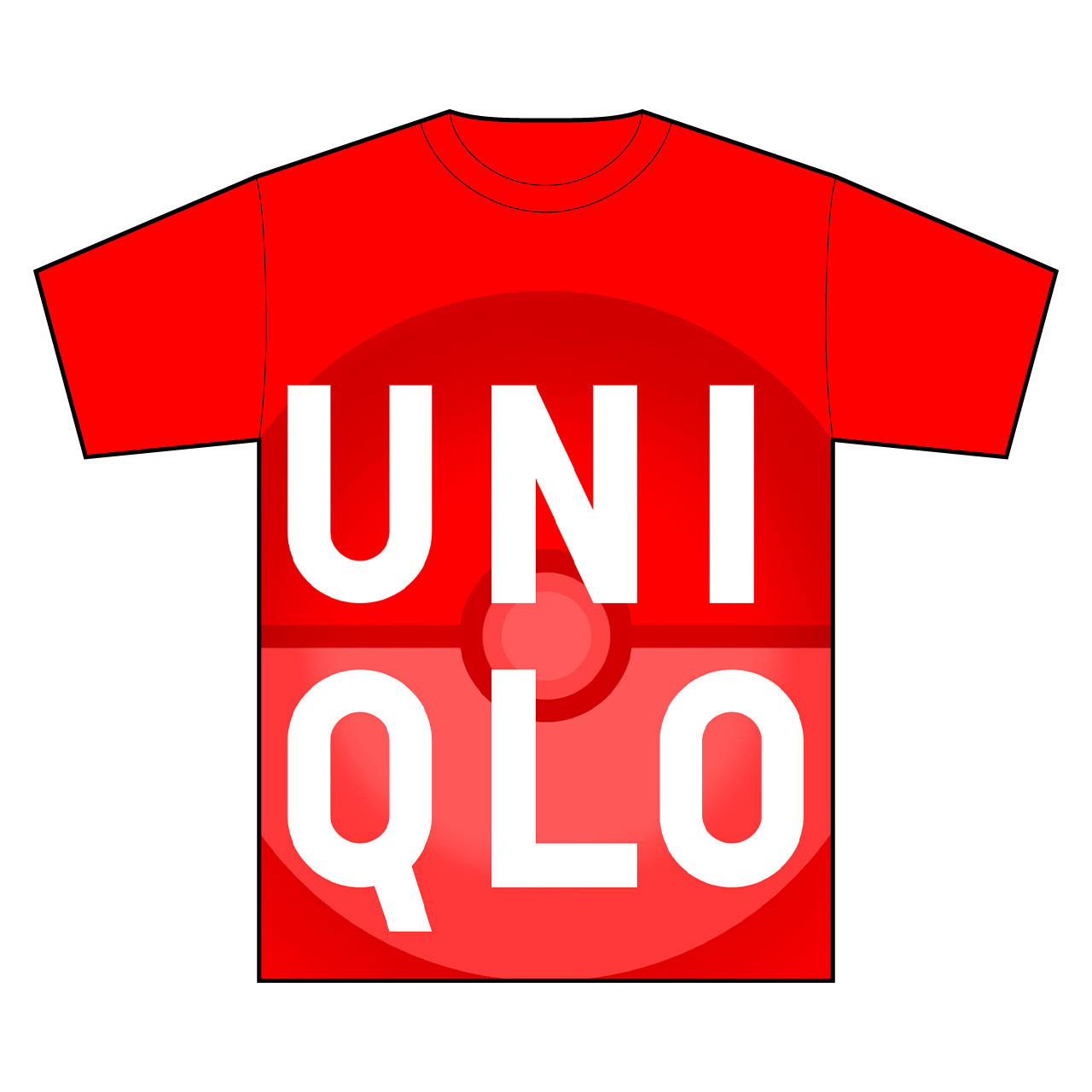
This design was an accident. When I placed the custom UNIQLO logo into the t-shirt template file it came in about this big and looked cool. So, I decided to capitalize on that and got to reuse work already done again! This is another tough call, I don't know if I like the white or red shirt better... how about you?
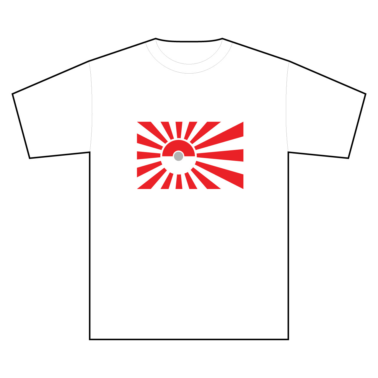
UNIQLO is a Japanese company and I thought the Japanese flag with it's rising red sun was another perfect opportunity to use the iconic Pokeball. I did a little research and found that there was a variant flag specific to the Japanese Imperial Navy that featured rays radiating from the central circle. I flattened and simplified the Pokeball as much as I could while still being able to recognize it as a Pokeball. I think it works and it pops, thanks to the fact that the flag already popped!
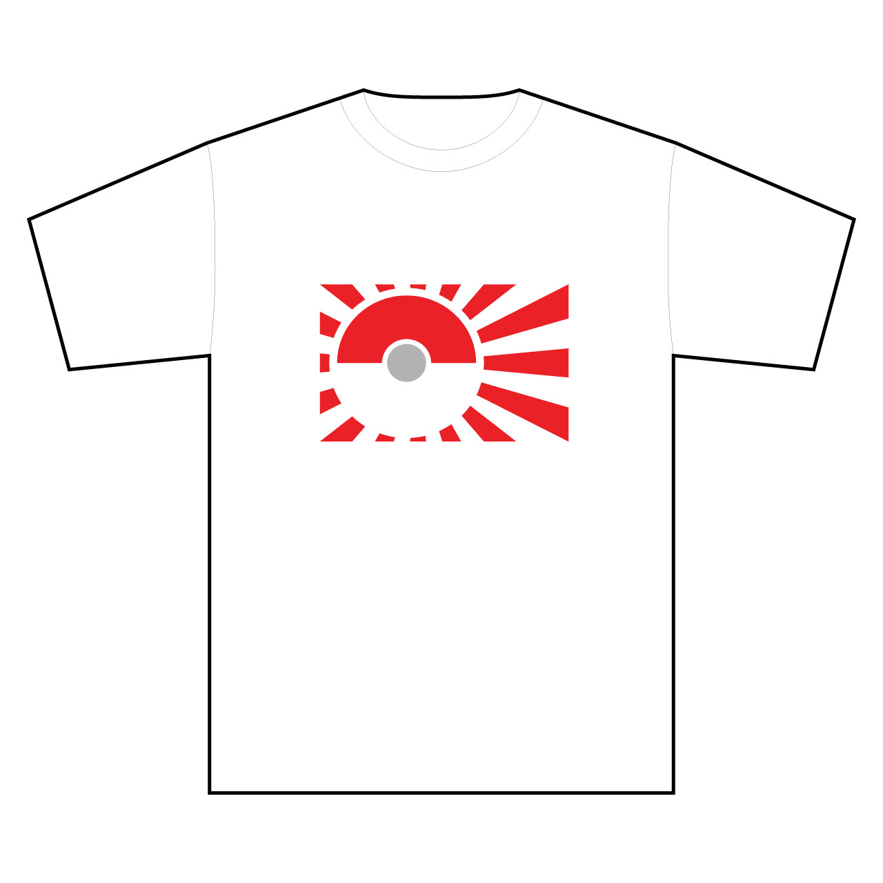
I played around with cropping the variant Imperial Navy Flag graphic and I thought this version looked pretty cool so decided to enter it as well.

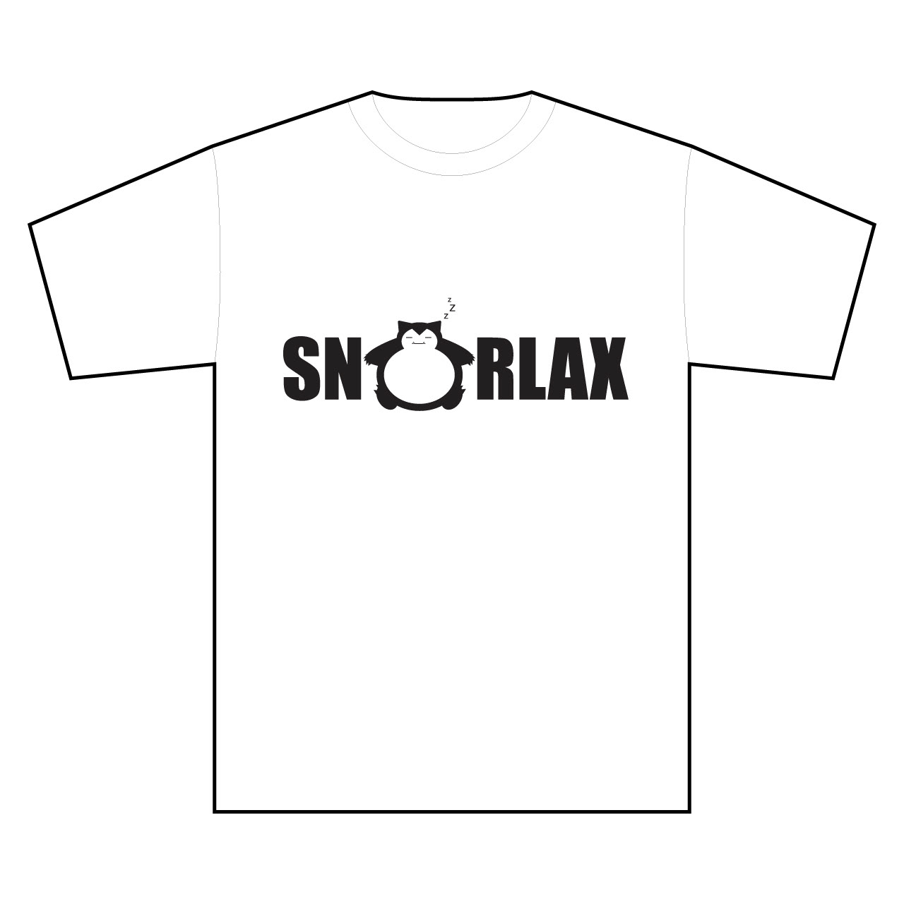
I've seen "Frankie say Snorlax" shirts out there that already do a play on words with the Pokemon Snorlax. But, I've always liked the variant that just says "RELAX" better and I thought it made more sense in this case because I'm changing one word with one word. People I showed this too thought it was too simple and not creative enough (but isn't that the point - Snorlax literally just sleeps all day he wouldn't bother to put any work into his shirt...?) I decided to do one more variant of this shirt (below) that has a little bit more effort put into it...
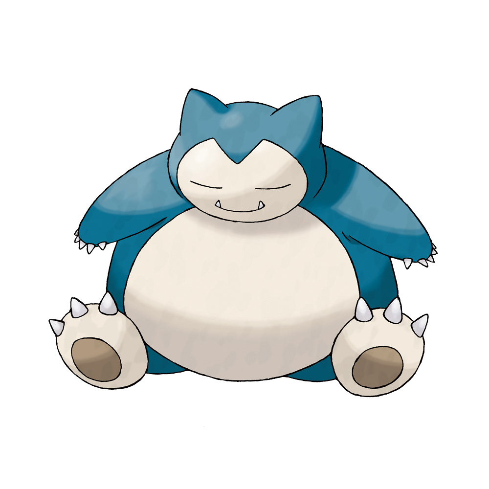
Reference image of Snorlax provided on the UTGP site: https://www.uniqlo.com/utgp/2019/us/character#101-200